Learn more about using the Unity UI module for Makinom 2’s UI system.
Unity UI is Unity’s component-based UI system. When using the Unity UI module for Makinom 2’s UI system, the look and layout of your UI boxes or HUDs is set up in the Unity scene view, creating prefabs to use in Makinom’s UI boxes and HUDs.
The Unity UI module is imported into the Makinom 2 DLL folders:
- Assets/Gaming Is Love/Makinom 2/DLL/
- Assets/Gaming Is Love/Makinom 2/DLL/Editor/
The UI module has to be in the same folder as Makinom 2’s DLLs to ensure the correct compile order by Unity.
Using the Unity UI requires the TextMesh Pro package to be added to the project via the Unity package manager – if you’re using Unity 2019.3 or newer, you’ll also need the Unity UI package. Both packages are usually added in a new Unity project automatically. Please note that only verified package versions are officially supported.
To set up Makinom for using Unity UI, go to UI > UI System in the Makinom editor and select Unity UI as the UI System Type.
UI Layers #
Each UI layer you add in Makinom will create it’s own canvas. In case you need a special setup for your canvas (e.g. adding a Canvas Scaler component), you can select a prefab of that canvas in the UI layer.
If no prefab is provided, Makinom will create a new canvas from scratch, using the settings defined defined in UI > UI System.
Sorting Order #
The sorting order of the UI layer’s canvas will define in which order they’re drawn on screen. UI layers have a setting to define the sorting order – if not used, it’ll use the sorting order of the selected prefab’s canvas or, if no prefab is used, the UI layer’s index (i.e. the order in which they’re listed in the Makinom editor).
The sorting order is crucial to keep in mind, e.g. when you want something to be displayed above the screen fader, or keep the flying texts below all other UI.
UI Layouts #
The components for UI boxes (UI Box component) and HUDs (HUD component) define the anchor they’ll use for positioning in a layout via the Layout Anchor setting in their Position settings.
UI Boxes #
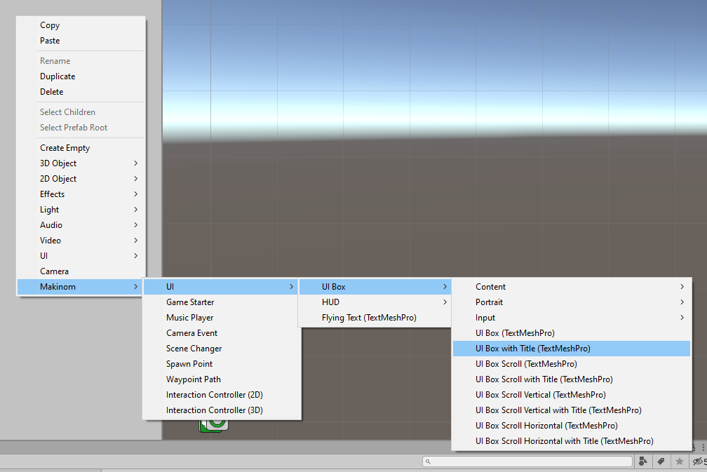
You can create UI boxes easily using the scene view’s context menu, Makinom > UI > UI Box offers a variety of one-click UI box creations, that you can further place and style to your liking.
There are additional context menu options available:
- Makinom > UI > UI Box > Content
Create various content-related components/game objects.
Most of them will automatically handle setting up their references in the UI Box component, except for the Additional Content, which you need to reference manually where you want it to be used (and define their Content ID). - Makinom > UI > UI Box > Portrait
Create various portrait-related components/game objects.
Portraits are e.g. used by dialogues to display the current speaker. Portraits can be textures, sprites or prefabs, the UI Portrait component will let you define where/how to place them.
Adding portrait components via the context menu will use the first added as the main portrait and add the following as additional portraits (you still need to set up their Content ID). - Makinom > UI > UI Box > Input
Create various input components/game objects.
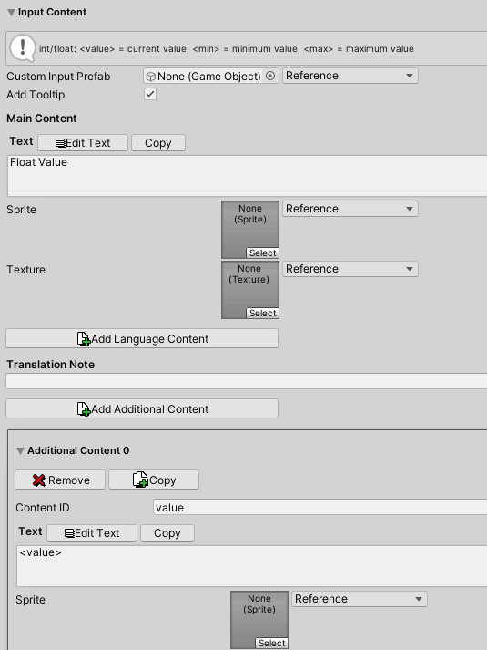
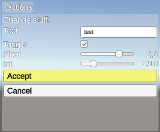
Add ok/cancel buttons or selection cursors to the UI box, or use them to create input prefabs for choice buttons, toggles, input sliders or text fields (can also be used by UI boxes as predefined/placed inputs).
To use your set up game object (and components) for a UI box you need to create a prefab out of your setup (without the canvas it’s attached to during the setup). Afterwards, go to UI > UI Boxes in the Makinom editor, select the UI box you want to use it on (or add a new UI box) and select your prefab as the UI Box Prefab (only available if you’re using the Unity UI module).
The UI box setup (in the Makinom editor) also includes some additional features, e.g. which UI layer the box should be displayed/placed on, audio clips for cursor/accept/etc. as well as content definition for things like the ok/cancel buttons. Most of these settings can be made for all UI boxes in the General Settings of the UI boxes and each UI box can optionally override these settings.
Content #
The main component for displaying content is the UI Content component (used by both UI boxes and HUDs), which manages which components are used to display text, sprite and texture content that should be displayed. Displayed content can e.g. be the text of a dialogue or the content of a dialogue’s choice, but also the title of a dialogue or descriptions of the currently selected (or hovered over) input.
The default implementation of the UIContentComponent uses TextMesh Pro to display text (TMP_UIContentComponent), if you want to use a different component for text display, you can create your own variation by deriving your class from UIContentComponent.
Using Multiple Contents via ‘Content ID’ #
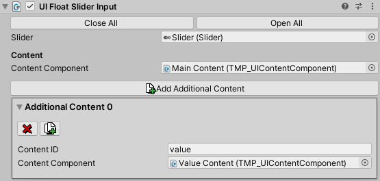
In most cases, you can define a primary/main content component as well as add additional content components, that can be used via their Content ID. Wherever you set up the content that will be displayed (e.g. a dialogue’s text, the text of a choice or name of an input field), you can add additional content with a Content ID.
The additional content will be displayed using the UI Content component with the matching Content ID within the content displaying context – e.g. a dialogue’s message content is displayed by the Main Content of the UI Box component while an input’s content is displayed by that input component’s content components.
The UI Box component has separate content setups for the Main Content (e.g. the message of the dialogue), the Title Content (e.g. the title of the dialogue, displaying the speaker’s name), an optional Description (showing the description of a currently selected input) and Portrait (to display the portrait of the dialogue).
If the main content is within a Scroll Rect, make sure to have it selected in the Content Settings of the UI box to be able to scroll it using the horizontal/vertical input keys of the UI box.
Page Content #
You can use a UI Page Info component to display the current page (and number of pages) if your UI box displays multiple pages of text (separated by the page text code <#>).
Enabling Disable If Empty will hide the page info in case the currently displayed content has no pages.
Portraits #
The UI Portrait component is used to display portraits (used by both UI boxes and HUDs), e.g. for the speaker of a dialogue. Portraits can be sprites, textures or a prefab (e.g. for animated portraits).
UI boxes and HUDs can display multiple portraits by using a Content ID. Adding portrait components via the context menu will use the first added as the main portrait and add the following as additional portraits (you’ll have to define the Content ID manually in the UI box component).
Inputs #
Inputs are used for choice buttons (e.g. Choice type dialogues) and value inputs (toggles, int/float sliders, text fields, e.g. used by Value Option Dialogues). If the available inputs are not to your liking, you can create custom input components by deriving from the input type’s base class, e.g. UIBoolInputComponent for bool value inputs.
Makinom uses the prefabs you set up to create them as needed (e.g. adding choice buttons to a dialogue), the default prefabs used by all UI boxes are set up in UI > UI System in the Default UI Prefabs settings, each UI Box component can define their own prefabs their Input Settings (leaving them empty will use the default prefabs). Most content definitions for inputs allow you to select a Custom Input Prefab, which will overrule the other input prefabs.
You can also add input game objects/components to your UI box prefab as Placed Inputs, they’ll be used if their input type matches the input the UI should display at that index (e.g. if a dialogue displays a choice as the first input, Placed Input 0 has to be a UI Button Input). This can be used to create custom layouts that are otherwise not possible with Unity’s layout components.
If inputs are placed within a Scroll Rect, make sure to have it selected in the Input Settings of the UI box component.
Selection Cursor #
The UI Selection Cursor component is used to place something to mark the currently selected input. It should usually be added as a child object of the UI box itself.
The cursor can also be animated using an Animator or Animation component.
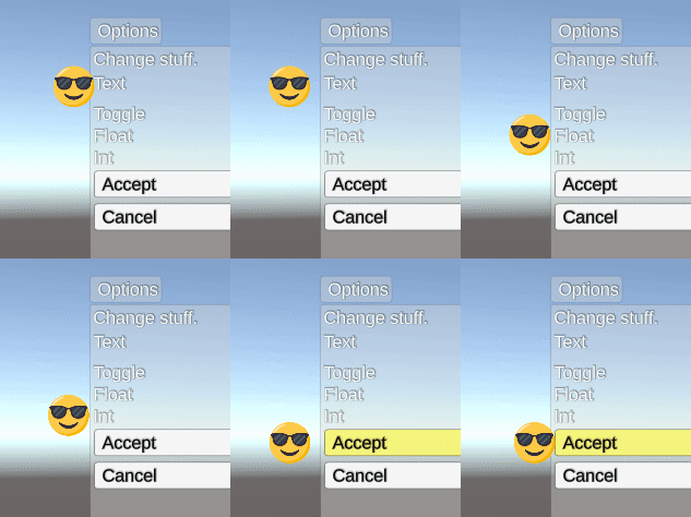
The cursor is placed on the selected input using the cursor’s rect transform’s own anchors, pivot and position/offsets, e.g. using middle center anchors will place the cursor (i.e. the cursor’s pivot) on the middle center of the selected input’s bounds. E.g. to place the cursor on the left side of the input as in the GIF above, use middle left anchor.
HUDs #
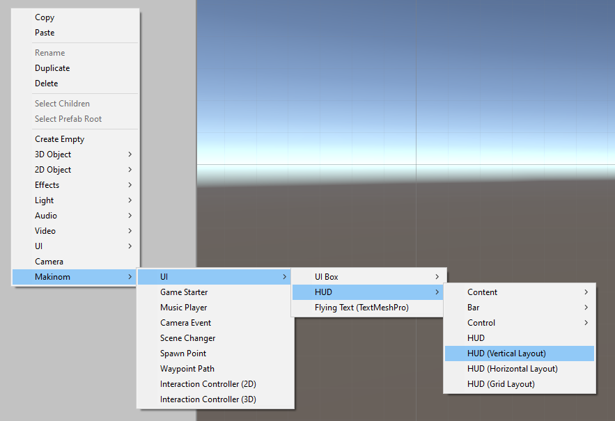
You can create HUDs easily using the scene view’s context menu, Makinom > UI > HUD offers a variety of one-click basic HUD creations with different layouts, that you can further place and style to your liking.
There are additional context menu options available:
- Makinom > UI > HUD > Content
Create text and portrait components/game objects. - Makinom > UI > HUD > Bar
Create various value bar related components/game objects, e.g. for a health bar. - Makinom > UI > HUD > Control
Create control components/game objects, e.g. for virtual controls like buttons and joysticks.
Additional components are also available via the component menu, e.g. the HUD Condition component for hiding parts of the UI under certain conditions.
To use your set up game object (and components) for a HUD you need to create a prefab out of your setup (without the canvas it’s attached to during the setup). Afterwards, go to UI > HUDs in the Makinom editor, select the HUD you want to use it on (or add a new HUD) and select your prefab as the HUD Prefab (only available if you’ve set the Unity UI module). The HUD setup also includes some additional features, e.g. which UI layer the HUD should be displayed/placed on, display conditions, etc.
While Makinom features HUD types for different purposes, the actual components to display content in your HUDs are not limited to a certain HUD type. E.g. you can add a virtual control to your Interaction HUD or display a text and value bar in a Control HUD.
Content Providers #
HUDs distribute their content to the components displaying the content via HUD Content Provider components, e.g. the base HUD component, that’s usually at the root of each HUD is a content provider. The content provider provides the user/source of the content and is also responsible for causing the content to be updated in case something changes.
Each content displaying component can define which content provider it uses, when adding a content component it’ll automatically select the first content provider it’ll find in their parent game object hierarchy. You can have multiple content providers in a HUD, each managing their own content components. This also allows you to e.g. use HUD content in a UI box or any other custom UI you’re using – as long as there’s a content provider, the different HUD content components can display content.
Beside the HUD and base HUD Content Provider components, there’s also the HUD Content Provider (GameObject) component available, which lets you define a game object and input ID (e.g. for controls) that will be used. You can create your custom content provider components by deriving from the HUDContentProviderComponent class.
Content #
The main component for displaying content is the UI Content component (used by both UI boxes and HUDs), which manages which components are used to display text, sprite and texture content that should be displayed. The default implementation of the UIContentComponent uses TextMesh Pro to display text (TMP_UIContentComponent), if you want to use a different component for text display, you can create your own variation by deriving from UIContentComponent.
HUDs define the content that will be displayed by the UI Content component by using HUD Text Content components. They define the text that will be used, which UI Content component should display the content and the variable origin in case variable text codes are used. There are some context relevant text codes available to add content information e.g. the name or description of the HUD’s user (via the content provider), which could be the name of an interaction or scene object.
Portraits #
The UI Portrait component is used to display portraits (used by both UI boxes and HUDs), e.g. for the HUD user’s portrait (via the content provider). Portraits can be sprites, textures or a prefab (e.g. for animated portraits).
HUDs define the portrait that will be displayed by the UI Portrait component by using HUD Portrait Content components. They define which portrait type to display and from which content provider the portrait will be taken.
Bar #
Value bars are used to display numerical values as a bar or visual representation, e.g. a health bar displaying the player’s health. Displaying the bar is handled by HUD Value Bar components, the default implementation uses sprites to display the bar (HUD Value Bar (Sprite) component) and also allows changing sprites and colors based on the filling (in percent) of the bar (e.g. a health bar turning red if it’s below 25%). You can create custom value bar components by deriving from the HUDValueBarComponent component.
Using the Change Fill Amount setting (on a HUD Value Bar (Sprite) component) requires using the Filled image type on the Image components. This will control the fill amount of the sprite by the value bar’s filling (in percent).
The content of the bar (i.e. the numbers the value bar represents) is defined using a HUD Value Bar Content component. It defines the current, minimum and maximum value the bar represents – you can define an optional display value, which allows you to display positive and negative changes to the current value (e.g. showing the damage that has been dealt). Keep in mind that value bars just display the values, i.e. processing the change (e.g. changing the display value to the current value over time or after some time) has to be done somewhere else.
Icon Bar #
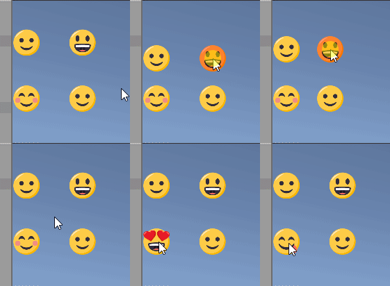
Icon bars are a special kind of value bars – instead of displaying a single value bar for the defined value, it’ll display multiple value bars, each bar represents a defined amount of the displayed value. E.g. displaying heart icons instead of a bar to represent your health.
The HUD Icon Bar Content component is used to create an icon bar, the setup is similar to the value bar content, but has additional settings to define the value each icon (i.e. each individual value bar) will represent, either as an absolute value or in percent. You can add pre-placed icons and define a prefab that’ll be used to create additional icons as needed. Since each icon is a value bar (HUD Value Bar component), you can set them up as needed, e.g. having a heart icon represent 4 health, changing it with each point that’s missing.
Control #
Controls are used to display virtual inputs on screen, e.g. buttons and joysticks. HUD Input Display components are used display the controls. There are two default implementations available, one displays the control as sprites (HUD Input Display (Sprite) component) and one uses game objects (HUD Input Display (GameObject) component). Displaying an input as sprites allows you to change the displayed sprite or the sprite’s color for the input’s non-pressed, pressed and cursor over states. Using game objects lets you use different game objects for the 3 states (enabling/disabling them as needed).
If your visual control is just a sprite, use the sprite input display – if you want to make it a bit complexer visually, use the game object input display. You can create custom input display components by deriving from the HUDInputDisplay component.
HUD Control Content components are used for displaying the actual virtual control (using the HUD Input Display components).
There are separate components available:
Button Input #
The HUD Button Control Content component is used for simple button controls.
Axis Input #
The HUD Axis Control Content component is used for single-axis controls, e.g. a horizontal or vertical input.
Joystick Input #
The HUD Joystick Control Content component is used for double-axis joystick controls, e.g. a horizontal and vertical input.
Other Components #
There are additional components available to manage the visibility of individual elements of your HUDs or add other functionality.
Conditions #
The HUD Condition component is used to show/hide parts of the HUD based on defined conditions (e.g. game states or variables).
If the condition is valid, the game object will be enabled (or stay enabled), the condition being invalid will disable the game object the condition component is placed on, hiding everything on itself in its child objects.
You can create custom conditions by deriving from the BaseHUDCondition class (namespace GamingIsLove.Makinom.UI) and implementing the Check function.
Clicks #
The HUD Click component is used to perform an action when clicking on the game object it’s attached to (e.g. a sprite in your HUD). You can add multiple click actions to each HUD Click component.
The following click actions are available:
- Toggle HUDs
Toggle HUDs on/off. - Global Machine
A global machine is started, using the HUD’s user as machine object and the player as starting object. - Tagged Machine
A tagged machine is started, either on the HUD’s user or all tagged machines in the scene. - Schematic
Starts a defined schematic, using the HUD’s user as machine object and the player as starting object.
You can create custom click actions by deriving from the BaseHUDClickAction class (namespace GamingIsLove.Makinom.UI) and implementing the Click function.
Flying Texts #
Flying texts are created using the scene view’s context menu, Makinom > UI > Flying Text (TextMesh Pro) creates a basic flying text game object that’ll display the text using TextMesh Pro.
Like with UI boxes and HUDs, you need to create a prefab out of it and use it when a flying text is defined (e.g. using the Show Flying Text node in a schematic).
The main component for displaying the flying text is the UI Content component, which manages which components are used to display text, sprite and texture content that should be displayed. The default implementation of the UIContentComponent uses TextMesh Pro to display text (TMP_UIContentComponent), if you want to use a different component for text display, you can create your own variation by deriving from UIContentComponent.
Flying text can define a primary/main content component as well as add additional content components, that can be used via their Content ID. Wherever you set up the flying text’s content, you can add additional content with a Content ID.
Open/Close State Changes #
UI boxes, HUDs and flying texts can use their Open State Change and Close State Change settings to play audio clips, animations or call custom functionality when opening or closing them.
Animations support both legacy Animation components and Mecanim Animator components. When using Animation components, you need to define the name of the animation that should be played. When using Animator components, you need to define the name of a Trigger parameter that is used in the animator controller to play the animation you want. You can do a lot of things using animations, e.g. fade in/out, movement or scaling changes.
Text-based Tooltips #
When using TextMesh Pro for displaying text, you can display tooltips for added content information using a UI Tooltip (TextMesh Pro) component alongside a TextMeshPro – Text (UI) component.
Tooltip information is automatically added when using global text codes for name, short name and icon of content. You can also add tooltip information to other text using the tooltip text code. Please note that this is only available for content that is directly referenced by the project.
When editing text, you can add content information via More > Data, any content that has an Add Tooltip button available there can be used for text-based tooltips.
